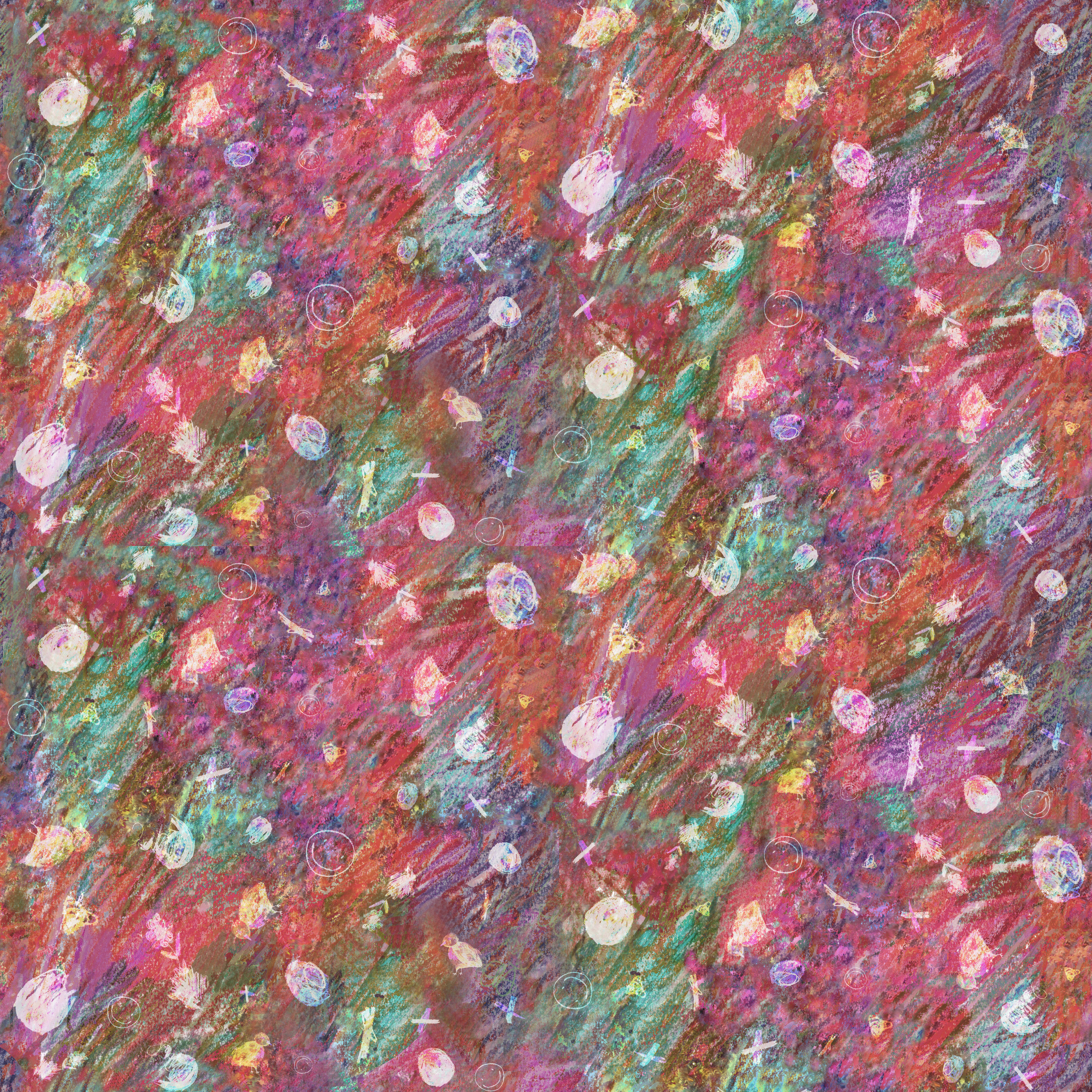

Soft Armour 2023
So... why is pattern making so much fun? I ended up taking a repeat design course for winter session here at RISD, and it was oh so very magnificent.
Wrote an artist statement:
The concept of this collection is childhood escapism. The vibrant colors and aggressive marks are an attempt to display the sentiments behind an adult attempting to ‘go back’ to their younger self. With time, the world becomes more complex as there is no easier way to ‘simply live life’. Every step is a struggle, ever breath is a fight, and eery effort can go unseen-it’s tiring to be an adult. The concept of being an adult is attributed to one’s legal position in relation to the state. One becomes a adult at the age of 18, recognized as a legal, autonomous being, and is expected to act in accordance with the turbulent and controlling laws. Of course, that is not to say that a government is completely and utterly the illain. There is benefit to regulating society as constant unrest can result in, perhaps, the demise of a system. But whose system are we living in anyways?
However, we are recognizing that there is indeed unrest. There is something peculiar about the system that we reside in. That is the responsible that many, if not all, of us want to run away from. There is no set answer or perfect solution to solve the series of problems that humanity has put forth before us. One can choose to be ignorant or indifferent to those matters in life but such actions o
nly enable problematic stances taken in the past (of which many of it is ongoing).
This project is an attempt at running away from those problems momentarily. To esape from the madnes life has put before us, yet never being able to fully escape from this purgatry. I am not asking the audience to understand, nor am I asking them to care for this setniment. This is simply an exploration of an adult trying to escape wit the hopes of becoming a fantasy: a myth of happily-ever-afters that never really worked out for many.
(why am I so critical and sad in this artist statement...)
And it all started from this mood board:
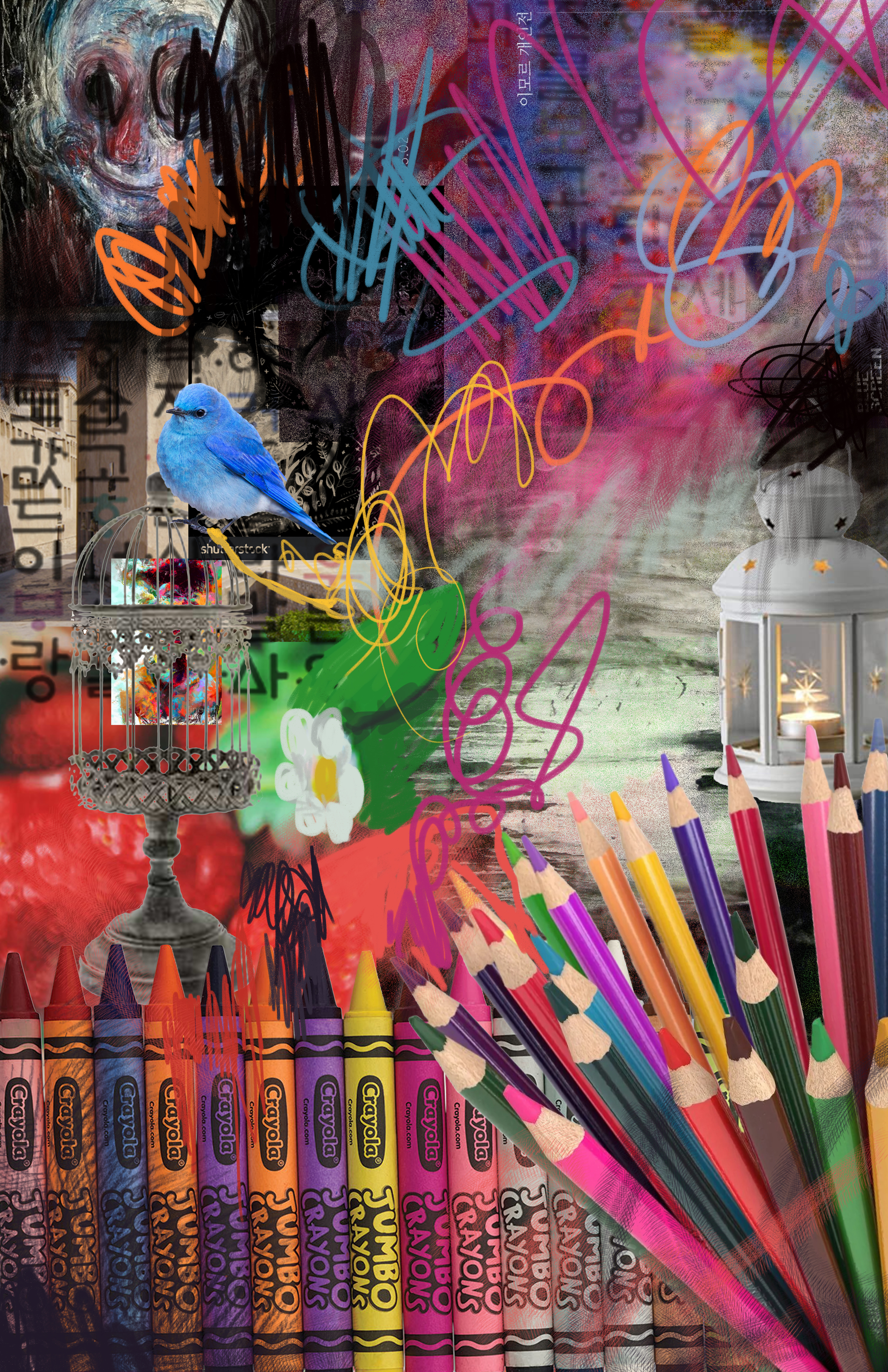
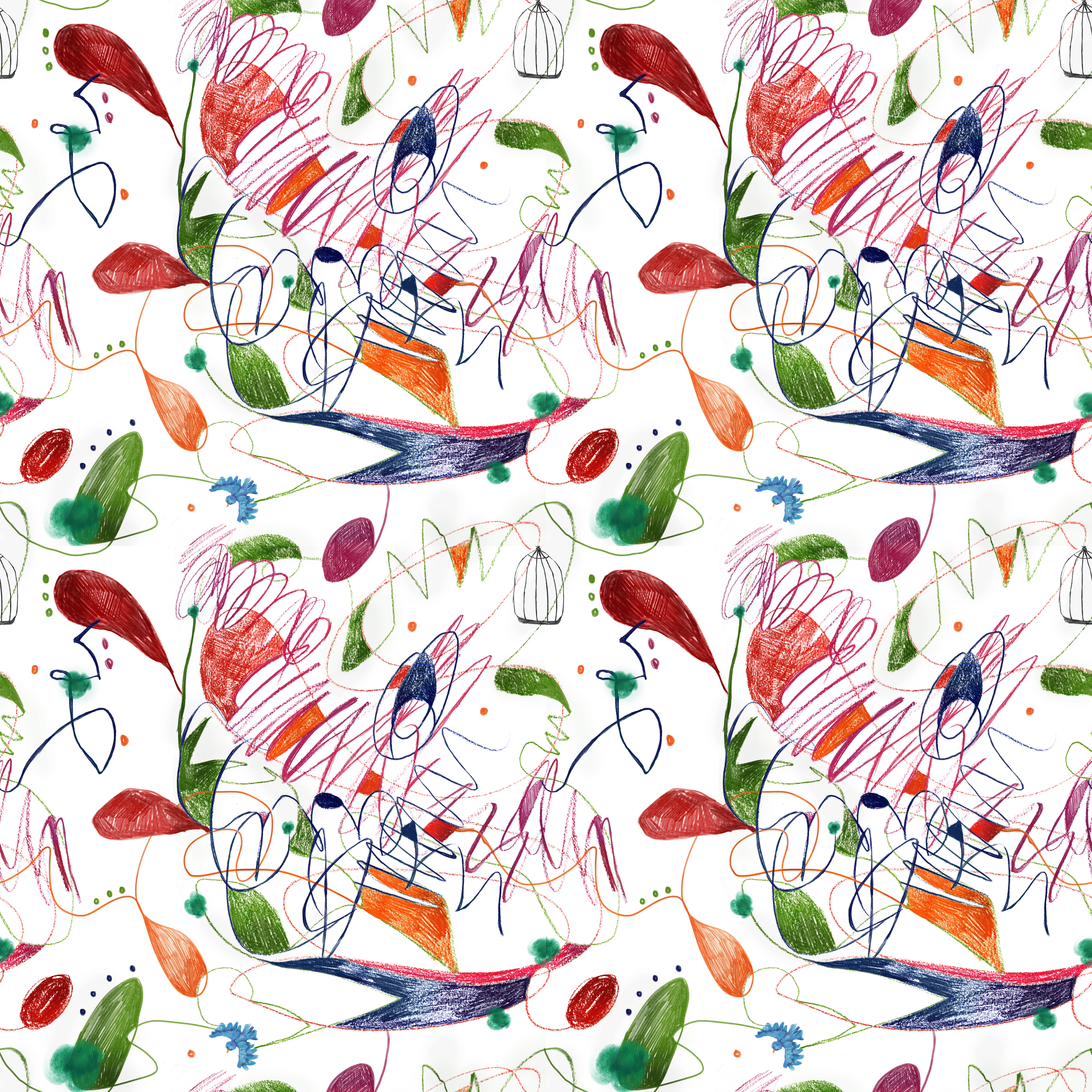
This was the main repeat design:
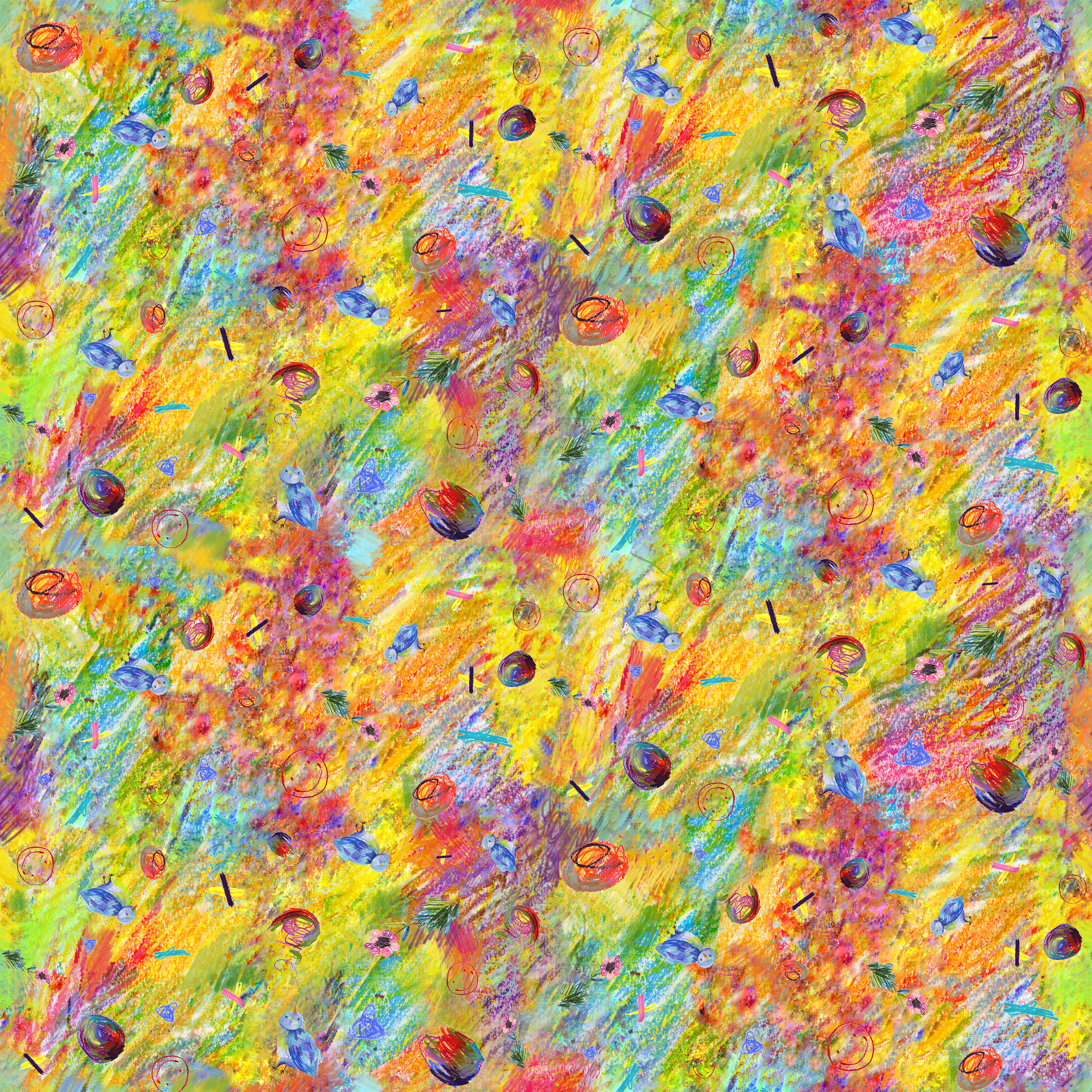

The 2nd colorway was chosen to be the MAIN DESIGN because it was easier to see the motifs in it
2nd Deisgn to accompany this collection: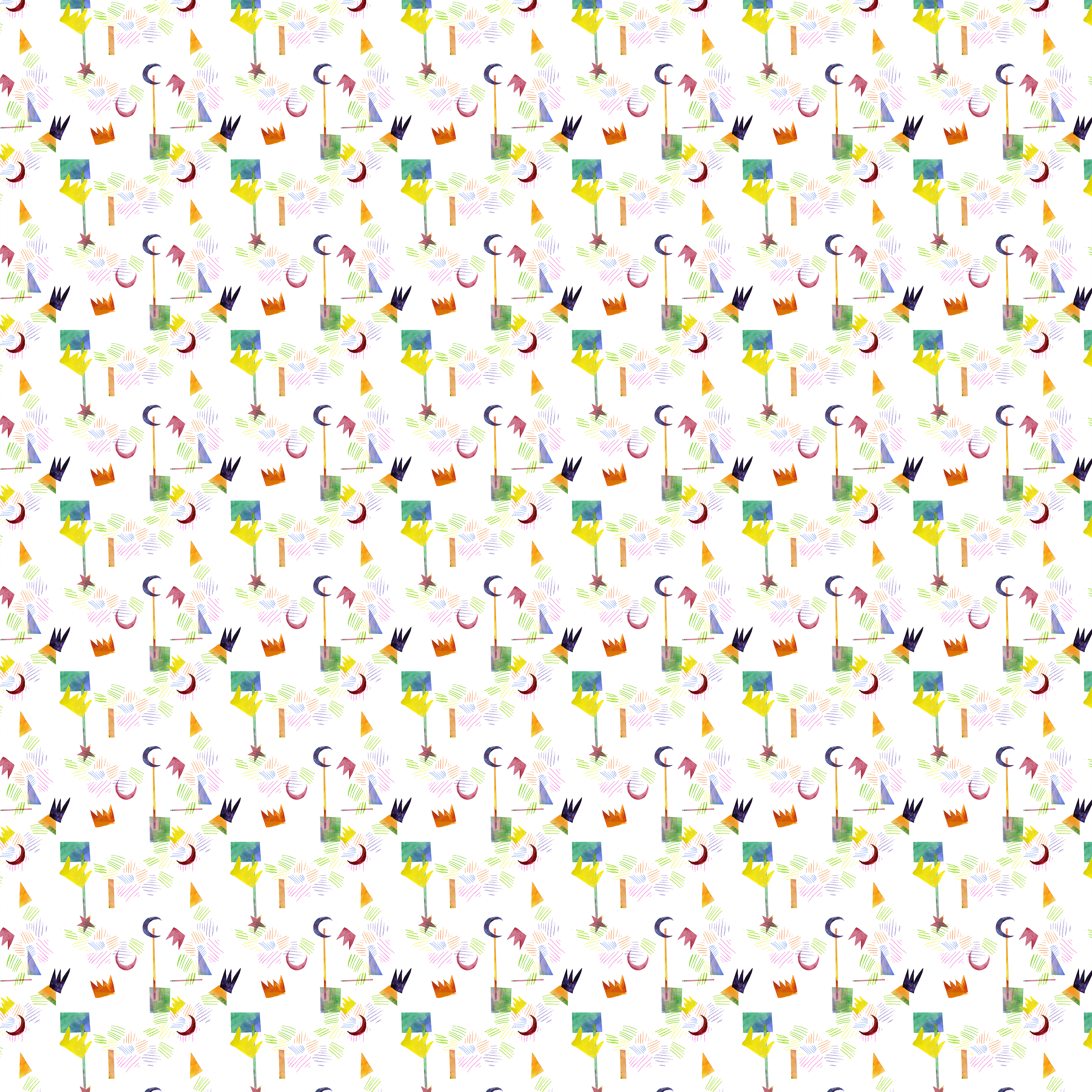

Final two:

The very last coordinate was mapped onto a bow tie with the monochromatic print:


